Barnes & Noble Booksellers Transit Rd
Audio & Visual Collection
Critiqued by Ene Belleh & Nicole Piscionere
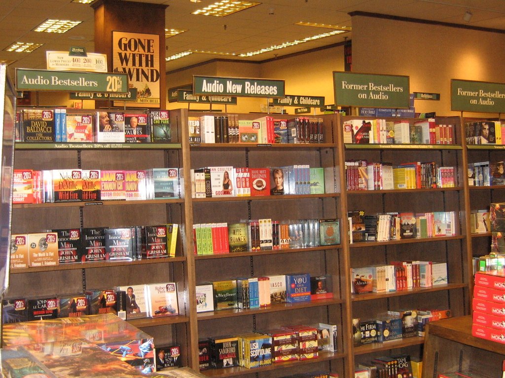
First things first- this Barnes & Noble is not a "super store" in that it is considerably smaller than most of its siblings.
Adult Book-On-CD/Tape
Main Isle
Sections include: Bestsellers, New Releases, Former Bestsellers
One bay at the end houses tapes all other are CD
IMPROVEMENT SUGGESTIONS
-Change Best Sellers and Previous Best Sellers to Fiction
-Divide it by popular genre: Mystery, Romance, SciFic and so on
-Start the rest of the Fiction in the last bay- continue on otherside
The Flip Side of the Main Audio Isle:
Fiction & Non-Fiction
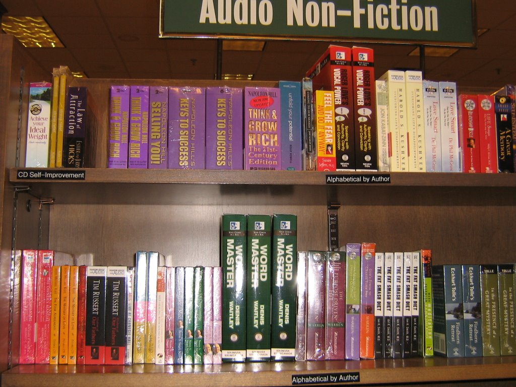
Improvement Suggestions:
-Continue with Literature/Fiction (non genre specific)
-Non-Fiction Area begin with its own New Release Section
-The Shelf Markers (small black labels on the shelves) need to be bigger and easier to see and read.
-Redefine the section, instead of "Audio Fiction" & "Audio Non-Fiction"
call it Books-on-CD, since it does not include all audio (music)
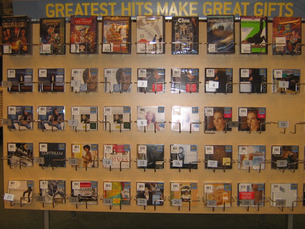
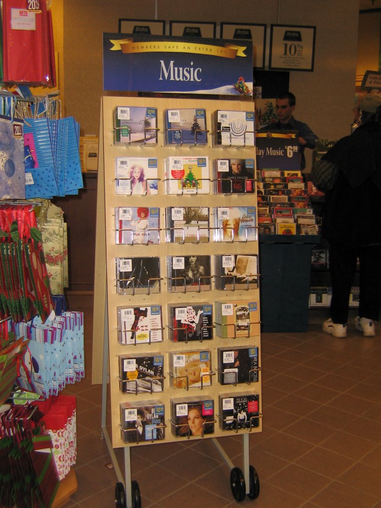
Adult Music CD Collection
Main Music Display
The music CDs are arranged numerically in order of maybe Greatest Hits since that is what the sign on the top of the rack suggests although no other explanations are given
 Improvement Suggestions
-Since this is rack is prominently displayed as customers check out, it could use eye catching appeal
-The numeric rating scale is WAY too vague. (Clay Akin a greatest hit???)
-Each 2 columns could feature Top 10 of different charts: TRL, Rolling Stone, Country Hits, Billboard, R&B…
-Splash come color on the background and heading caption, tan/brown is blah and not enticing
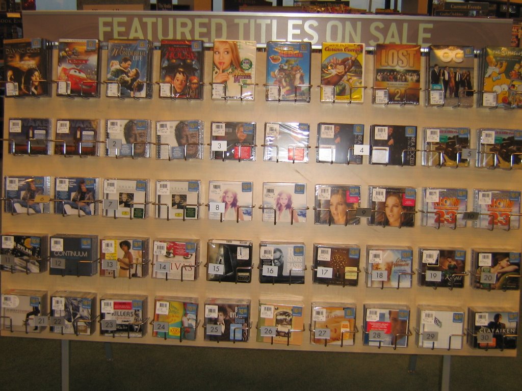
Flipside of Rack:
Similar arrangement different DVDs along top row
Rack header says Featured Titles on Sale- but they are the same on the other side
 Improvement Suggestions:
-Only have numeric ratings on other side
-Divide the section by music type (classic rock, jazz, country, pop…)
-Give DVD’s their own rack with divided sections by type (family,TV, documentary, new releases…)
Small Audio Displays
Cluttering the checkout area are revolving racks and stand-alone displays housing music and popular books-on-CD
 to aide the customers in
  last minute impulse buying
Improvement Suggestions
-Make clear signs notating what is being housed on the display
-Make sure main areas have the same selection, if not- communication with the customers about the location of theses displays needs to be incorporated into the main areas
DVD shelf behind the registers
 Improvement Suggestions
-A sign or top shelf status to alert customers of the DVDs housed here
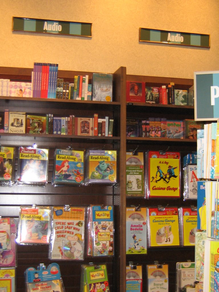
Kids Audio Section
Signs marking the section are too high and vague
The section is divided into two main categories:
Young Adult Book-on-CD on top two shelves
Children's Book-on-CD and music on remaining bottom shelves
 Improvement Suggestions:
-Use clearer signs designating the area- such as Teen Books-On-Tape
-Bring the signs closer to eye-level and make them more eye-catching
(Some kids might not understand the word "Audio."
-Children's section divide into 2 clear sections:
Books-on-CD & Music
-Add a few tapes to the collection, since there are still many children's toys with tape players on the market